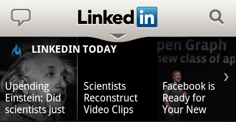
The LinkedIn app for Android always had nice visuals and recently they completely overhauled the app. For those not knowing LinkedIn, it’s a business-related social network connecting you with people you’ve worked with professionally or who want to work with you.
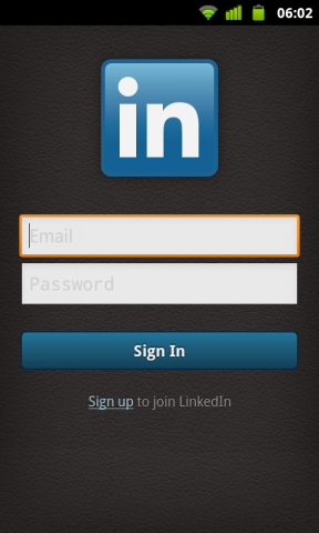
They chose some subtle skeuomorph elements like a dark leather texture as the main background. This one is most recognizable in the initial login screen.
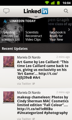
After logging in you’re greeted with the Updates view which shows the latest LinkedIn headlines in a picture grid at the top and the recent updates from your connections below it.
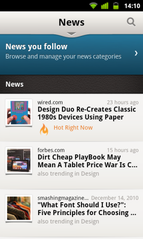
Tapping on the picture grid at the top opens the News view showing you all the news you’re following.
You browse the app with the navigation bar on top which is collapsed by default. This is a great way to maximize the space available for the content.
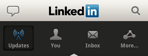
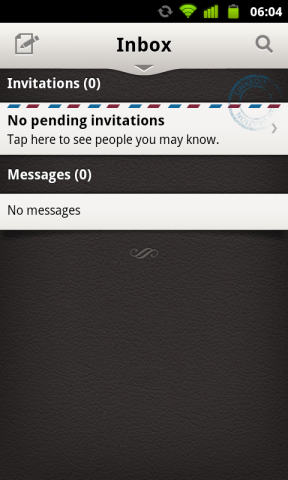
As every good social network LinkedIn allows you to send private messages to other users. In the mobile app this is represented in the Inbox view accessible from the navigation bar where you’ll find your invitations too. The invitations use a neat airmail-inspired visual theme.
So if you’re an active LinkedIn user this app is a must have and with the recent overhaul it has become really beautiful. Not only did they just add new graphics but the whole app is based on a more streamlined and more simple user experience compared to the old version. It’s available for free on the Market for devices running Android 2.1 or higher.
